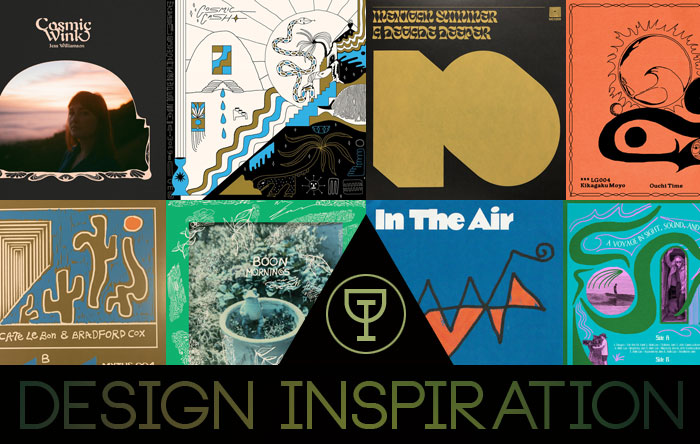
Design Inspiration: Bailey Elder 

Been a little while since I’ve had a Design Inspiration, but not for lack of trying. Designers prove to be just as busy as ever, but its worth the wait to see behind the veil of some of my favorites when they get a chance to lay down the influences on some of their best designs. Chances are if you’ve ordered a record off of Mexican Summer in the last few years you’re familiar with Bailey Elder. Her work graces the covers and layouts of a good swath of the label’s current output. Likewise if you frequent certain corners of music and wellness, upstate beers, and even national parks. Her work inhabits an earthen quality that fits forms that seem like they spring from nature itself. The lines aren’t bound by perfection, but somehow they seem preordained. Her work has graced works from Ariel Pink and Weyes Blood to Garcia Peoples. Yet as much as Bailey’s cover work is enviable, she’s a master of the inner cover and the back cover, letting the intricate details of the full package shine through instead of focusing just on the first impression image. She’s given us few covers that have inspired her over the years and a little insight into how they’ve affected her work. Check out Bailey’s picks below.

Philip Glass / Robert Wilson: Einstein on the Beach, 1978
I love the typography on this record so much! This cover was designed by Milton Glaser, a true wizard and magic man. I believe this was a custom typeface designed by Glaser, the slanted crossbars are just so rad and I love how they are all in contrasting red. The letter “B” is also very unique and special. The portrait is pretty mind blowing and really sets the mood for the album. If anyone knows if / when this font will be digitized please let me know!!

Nico, Gianni, Frank & Maurizio: Canti D’Innocenza, Canti D’Esperienza, 1973
I am a really big fan of album artwork that uses simple / minimalistic graphics. This album cover was designed by Gian Carlo Greguoli, whom I really do not know too much about! The font is Stack, which was used on many covers in the 70’s, designed by Les Lawrence in 1969. I love that Les Lawrence worked in the commercial art world and then proceeded to become a multifaceted artist in sculpture, ceramics, water color, etc. He dove into different ponds, and that is inspiring.


Ash Ra Tempel: Schwingungen, 1972
I love this illustration work, the movement of the leaves and the clouds. The inside is super special too, I love the handwritten lyrics / credits. This was designed by Bernhard Bendig, who also did the design for their first record Ash Ra Tempel, equally as cool, but in a different way. I mean all of the Ash Ra Tempel cover’s are pretty cool.


Maceo And All The King’s Men: Doing Their Own Thing, 1970
The shapes and layout in this artwork are really nice, I love when a back and front cover relate to one another! You can tell that the designer used the circular portraits to make that blob like flower geo shape, or maybe that shape came first? Weird, obscure handwritten type on the back pulls at my heartstrings.


Jerry Garcia: Compliments of (Garcia), 1974
Designed by the great Victor Moscoso, I love everything about this. Colors, type, the textural essence to it, soooo good.

U-Roy: Version Galore, 1971
I am not sure who designed this, but I love this layout and the colors used. The photos are like just on top of this gold record, such a random weird, nonchalant layout and I’m really into it! The photos are amazing too.


