Design Inspiration: Ardneks 

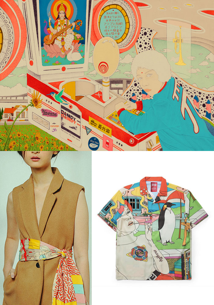
The Design Inspiration series has long been one of my personal favorites around here. As much as I love the songwriters and bands that make up the bulk of the coverage here, I’m equally enthralled by the visual artists who define the look of modern psychedelia and forward-thinking graphic design. Usually this feature focuses on cover art, and today’s artist has certainly created a few memorable ones, including recent favorites from Shana Cleveland and Flamingods. However, at heart Ardneks is a master of poster art, weaving intricate details into packed designs that pop with a shock of colors. So, after some discussion on the expansion of scope in this feature Ardneks picked the five posters he found most influential on his style and I’ve highlighted some of his own detail-packed work above. Check out his picks below, a true tour of some of some psychedelic bedrock.
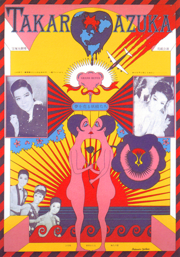
Tadanori Yokoo: Takarazuka Grand Revue, 1966
Tadanori Yokoo is my Elvis, I worship him. You can notice how heavily he’s influenced my work. His chaotic psychedelic way of composing things is singular unlike any other. I remember seeing this particular piece in person at his museum in Kobe. I stared at it for a long time trying to notice every little detail. The melting heart-shaped world, the mid-crashing plane, the feminine symbols, how the two female figures point at each other’s nipple, and the fact that everything is screen printed are all mind-blowing. It’s a poster he created for a local all-female musical theater troupe, Takarazuke Revue. How he laid out the photos and the 2D shapes and lines reminded me of Motown posters, but on Quaaludes.

Victor Moscoso: Blues Project at the Matrix, 1966
This one left a huge impression on me. It’s one of the first posters I saw that really got me hooked into the world of psychedelic poster art. I’ve never seen anything like it at the time. The composition, the thermal-esque colors and the play on positive-negative is so far-out it melts your eyes. It’s as if the fonts are vibrating out of the 1890s-looking belly dancer. I don’t know if it was the magic of acid, but Moscoso is sure a visionary.

Gary Grimshaw: Black to Comm at the Grande Ballroom, 1967
This one just looks so badass. That multi-exposure photo of Rob Tyner from MC5 is kind of ahead of its time. The black and yellow fonts laid out resembling a book opened, you don’t see that classic batman logo color combination often. It brought out this loud lightning-like energy in the all Detroit rock line up.
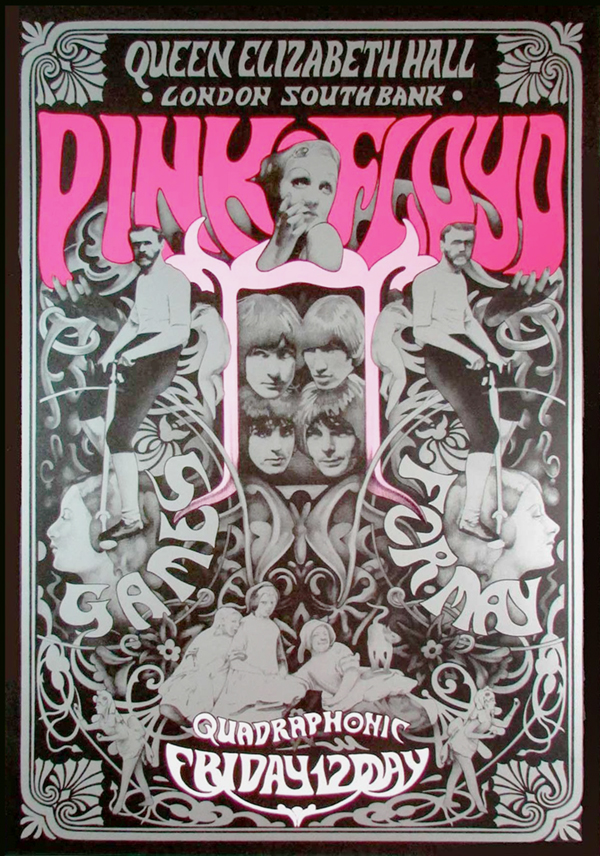
Steven Harradine: Pink Floyd at Queen Elizabeth Hall
There weren’t many Syd Barrett era Pink Floyd poster but this one definitely stood out. It’s a poster for their headline gig at Queen Elizabeth Hall that marked the first use of quadrophonic surround-sound. The perfectly hued pink really brought the black and silver Victorian-esque illustration come to life. I love seeing an undercurrent of symmetry in designs, and this poster is a great example of it.
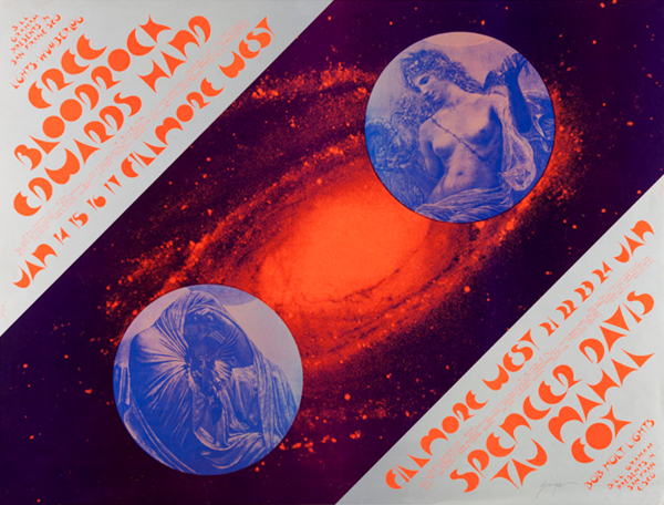
David Singer: Filmore West, 1971
Landscape poster is always a treat when done right. The red-blue-silver combination on this is amazing to look at. I love how that splattered red galaxy in the center divides the two circled blue beings, and how he chose this lunar-looking typeface that perfectly matched the whole cosmic Art Nouveau theme.
Check out more works from Ardneks over at his SITE