Design Inspiration: Callum Rooney 

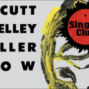
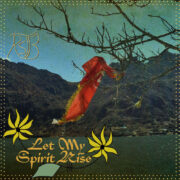
Got a new round of Design Inspiration today, and it’s a designer whose covers and posters have popped up in rapid succession of late. If you’ve hung around any corners of the psychedelic swimming pool these past few years it’s likely that you’ve encountered the melted masterworks of Callum Rooney. He’s done cover designs for Forager Records, The Datsuns, L.A.’s Communicant, and his own band, NZ’s Ounce, shirts for Hoover III and Guardian Singles and posters for Kikagaku Moyo, A Place To Bury Strangers and Shonen Knife. His style has long evoked the kind of OZ magazine/ ’60s poster art surrealism that speaks to the heart of the site over here. He’s even lent his aesthetic to RSTB’s current tee shirt, giving a dose of delirium to the Raven name. I asked Callum to contribute a list of picks for the Design Inspiration Series and he’s plucked out five of his favorite cover designs that have helped to shape his style. Check out Rooney’s picks below and check out his site for new works.

Blue Cheer: Outsideinside, 1968
This sleeve painting nails the weird psychedelic landscape. The tiny people and weird foliage dispersed around the band is some sort of fusion of Dali and the movie Fantastic Planet but perhaps without the finesse of either. It just looks like some stoner’s bedroom painting. The art is just credited to a dude called ‘Arab’. Ultimate lowbrow art. I also love how composition spreads over the front and back of the sleeve in the gatefold fashion.

Captain Beyond: Sufficiently Breathless, 1973
This is just one of those classic 70s prog airbrush nuggets by Joe Petagno (who later designed the classic motorhead imagery) and Carl Ramsey. Weird characters lined up, surreal street scene wrapping around a gatefold. It nails the sci-fi psychedelia and I love the spacescape through the windows. I dig nonsensical portals and openings.

Hawkwind: Doremi Fasol Latido, 1972
It’s hard to pick just one sleeve because Barney Bubbles nailed all of the early LP sleeves of Hawkwind. He pretty much created the graphic world of the band in the golden era (and perhaps the look of the space rock genre in general) and the LP sleeves highlighted him as more than just a graphic artist but a packaging designer. Extra panel fold outs, die cutting, books, posters and printed inner sleeves… This one highlights his simple and bold emblem and logo design and I love his stylisation of chrome and spacescapes that harks back to 60s comics. I owe a lot to him.

Sun Ra: Celestial Love, 1984
Sun Ra’s album art is another tricky one to just single one out plus any album has probably 10 or variants on that art alone due to the DIY nature of the releases. The album design of his music fits perfectly and was pretty out there for the time when you think of the jazz LP design from the same time on a label like Blue note. I love the DIY ethos and aesthetic his stuff has – and a good 20 or so years before punk and the xerox flyer came along. His aesthetic is also the perfect fusion of egyptology and the cosmic, two things that have been a big influence on my work, executed in a bold simplicity.

Comus: First Utterance, 1971
This art is super creepy and I dig the simplicity of the black and white pencil or pen and the stark white background. It really does fit the bill for this weird underground folk music. The typography is badass, and once again another design that nails the gatefold use.


