Design Inspiration: Rob Carmichael [SEEN Studios] 
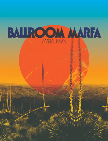
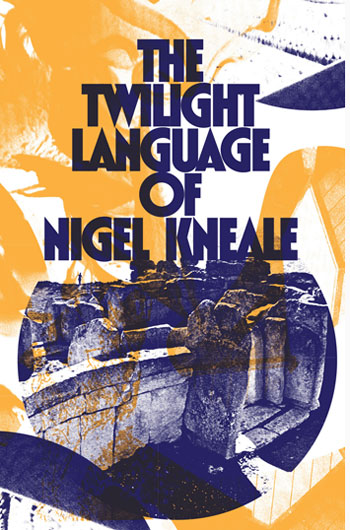
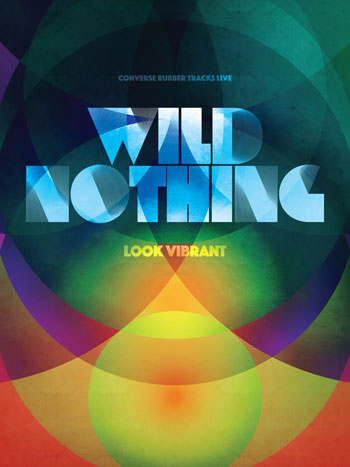
I’ve got another great entry to the Design Inspiration series this week (if I do say so myself). If you’ve been even a tangential fan of indie rock over the past ten years, there’s a good chance that you’ve run into covers from Rob Carmichael aka SEEN Studios. From the iconic cover of Animal Collective’s Merrieweather Post Pavilion to career defining works for Panda Bear, Dirty Projectors, Dan Deacon, Born Ruffians, Beirut, The War on Drugs, Cloud Nothings, and Real Estate – Rob’s been shaping the look of indie as much as any designer in the field. As usual with this series, I asked him to name five of his favorite record covers of all time and to delve into how those covers have influenced his own works. Check his picks below and catch up with Rob’s work over at SEEN.
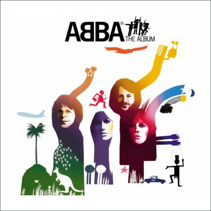
ABBA – The Album (Atlantic, 1977)
Design: Rune Söderqvist
My earliest album cover memory was this record, one that my mom loved. There weren’t a ton of records in the house and I probably wouldn’t say my mom was a music fanati, but there was a good stash of them kept near the giant near coffin-sized lift-top stereo cabinet. Abba: The Album looked the coolest and was the one I wanted to jam all the time – it didn’t hurt that “Take A Chance on Me” is like auditory pixie-stix to a 5 year old.
I kind of forgot about this cover for many years. But looking at it now –after many years of album design work under the bridge – it’s kind of incredible how relevant this sleeve is to the work I’ve done. It’s certainly a lot more illustrative than I normally go – the little marionette, the slightly twee shooting star, etc – but there are a lot of the SEEN studio default moves at work here: gradient fills, center-align-or-die title treatment, even the cut-up and recolored photo thing that I often do if left to my own devices. So my hat goes off to Mr. Söderqvist who blew my mind as a kiddo and still does.
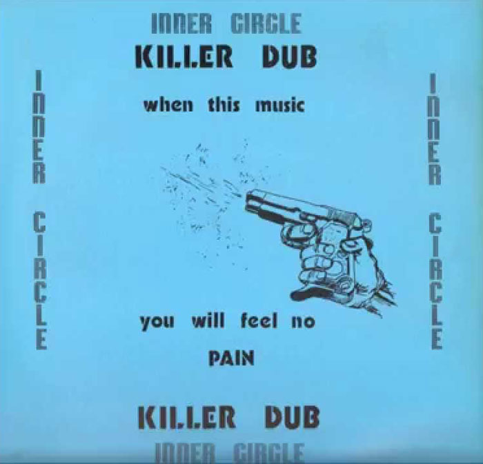
Inner Circle – Killer Dub (Top Ranking Sounds, 1978)
Truth be told I’ve never seen this sleeve in person. If anyone wants to sell me a copy, please get in touch! I first came across the cover in the liner notes to the Blood and Fire reissue of the two Inner Circle/Fatman Riddim Section records. It was printed fairly small in the CD booklet and even then it blew my mind. I subsequently looked up larger versions on the web. One day I’ll own the real thing.
Art-wise this is one of those deceptively simple sleeves that you might think pretty much anyone could do. You would be wrong to think that. To be sure the layout seems pretty haphazard and rough but nothing, absolutely nothing is unintentional here. And the gun image in full rebus mode is just devastating: powerful, scary, exhilarating all at once. The moment of confusion when one is figuring out what the cover is actually trying to get across is the power here. The best album design doesn’t hand you everything at once, it makes you work for it.
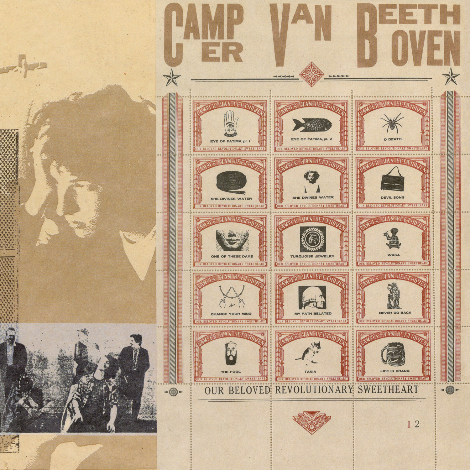
Camper Van Beethoven – Our Beloved Revolutionary Sweetheart (Virgin, 1988)
Design: Bruce Licher
Camper Van Beethoven were a huge deal to me in high school. I stumbled upon them in the suburb of Portland, OR I grew up in. I had no idea about college radio, punk, or really much of any of the music and culture I came to love later, and I wore this record out (and their subsequent one to) with repeated listens. At this point I was thoroughly convinced that I did not have the skill or insight to be an artist and I had no idea that graphic design was even a THING, much less a job that I would one day have.
Given all of this, I still found myself drawn to this album cover: stamp perforations, weird wood type (though I had no idea to call it that back then), off-center everything, throwaway images tuned into composition elements, it felt very old and super visually groundbreaking at the same time. I talk about this album a lot (I was pretty obsessed) and one day an older kid at my school told me that it had been nominated for a packaging Grammy and my brain cracked open – somebody made this on purpose! It had never occurred to me that this stuff was created intentionally. I found Bruce Lisher’s name in the liner notes and his work became a real touchstone once I got the courage up to call myself a graphic designer.
Dead C – Harsh 70s Reality (Siltbreeze, 1992)
Design: Michael Morley
I came across this record at the college radio station I worked at in the mid 90s. The sleeve felt like a dare, a total visual fuck-you to pretty much every record sleeve I had seen up to that point – mo title, no color, seemingly no content, just the title and catalog number on the spine. Given how relatively simple things are here it is striking how ominous meaningful this jacket feels. It was many years later that someone told me that the Dead C had simply photocopied and blew-up a record jacket by another band — Ut’s In Gut’s House, I believe – to create this one. A real Duchampian move that opened up even more vistas in my mind.
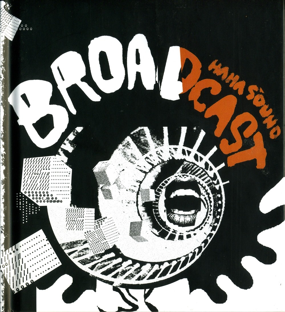
Broadcast – Haha Sound (Warp, 2003)
Design: Julian House
To be honest, it’s difficult to choose just one Julian House design to include in this list. There are nearly 10-12 record sleeves he’s done that could go on here – XTRMNTR, all the other Broadcast stuff, most Ghost Box releases, hell, even the BACK COVER of the Stereolab BBC Sessions CD (a near-constant reference). However, if I were forced to choose just one sleeve design to sum up what I love about Mr. House’s work it is Broadcast’s Haha Sound.
:format(jpeg):mode_rgb():quality(90)/discogs-images/R-214563-1221499846.jpeg.jpg)
It’s prime House aesthetics here: seemingly messy and dashed off but insanely deep and visually arresting. It touches upon Polish film posters, concrete poetry, comic book aesthetics, DIY photocopy moves and just about everything else I love visually. Even the restrained color palette works to the advantage of the composition. But what might be the most influential thing about House’s work – and what I keep coming back to – is that there is an essential awkwardness to the art here – the orange stops arbitrarily, the bubble letters feel dashed off, the legal text on the back cover feels tacked on in a very perfect way.
Julian House is a marvel.