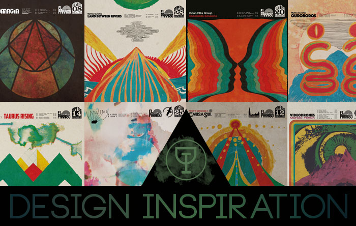
Design Inspiration: Jakob Skøtt 
For the third installment of the site’s Design Inspiration series, I’m focusing on Jakob Skøtt, who wears triple hats at the excellent Danish label, El Paraiso Records. Skøtt is co-owner, member of the band Causa Sui and chief designer of the label’s aesthetic. That aesthetic struck me immediately as being one of the most cohesive and attractive since Sacred Bones took up arms 10 years ago. Like SB, the label hearkens back to the idea of library sleeves or serialized jazz, tying their catalog together through crisp typography and the faded hues of Skøtt’s paintings. There are very few labels that I stumble upon and immediately want to buy wholesale on sleeve art alone but El Paraiso makes the case for buying blind and assuming a quality product. Below are Jakob’s picks for his five favorite album covers.
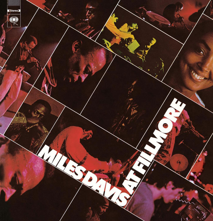
Miles Davis – Miles Davis At Fillmore (Columbia, 1970)
I like this collage so much that both the Causa Sui live albums are a pretty obvious homage to it. It’s simple, yet graphically bold and 100% consuming – I look at that and I want to be there. I can’t say that much else about it, since like Miles’ music from that period, I’ve wandered around in it for so long, I can’t help but feel like it’s become like a part of myself and my own style. I think that’s always been the best way to work – in both music and design – to just suck up all the influences you have and wear ‘em on your sleeve, because it’s gonna come out tangled together with everything else you’re into.
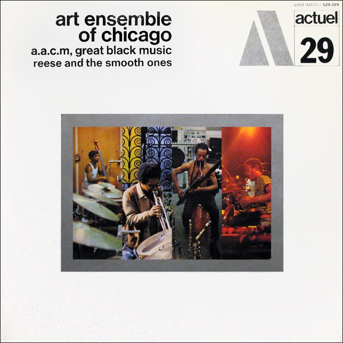
BYG Actuel label – Series of 52 albums on the BYG Records label, all released between 1969 and 1972.
The whole layout of the BYG Actuel label always caught my eye, and the fact that a lot of their catalouge was recorded in short bursts, churning out as many as 12 (!) albums in a week only adds to that fascination. It’s serialized design and iconography at it’s peak, yet it’s very subdued and the designer is not really showing off – that’s a rare combo that nearly no one does today: Easy to identify, yet working at the feet of the vibe of the music. I try to maintain that ethos in the stuff I do as well, trying to not let my ego get in the way of doing someone else’s artwork – using a template like we do is a very simple way of connecting to the “we” rather then the “I” when making album art.
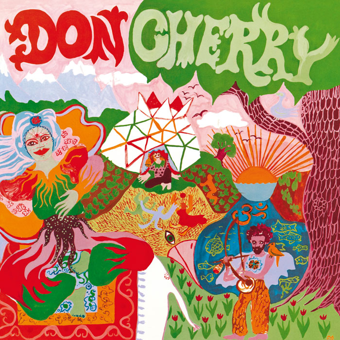
Don Cherry – Organic Music Society (Caprice Records, 1973)
I like covers that have style, yet I LOVE stuff that has a great vibe. This artwork is one that I grab whenever I’m in doubt if I’m over-doing something. It always makes my ideas seem very tame and controlled. It just has such a great flow and it makes me want to draw stuff with my kid’s markers. And very often when I do that, it ends up on an artwork. The album supplements the stuff going on here visually pretty perfectly – lots of bells and chanting – perfect for putting you into the zone of drawing in an uninhibited way!

Amon Düül II – Tanz der Lemminge (Liberty, 1971)
It’s easy to forget how hard it must have been to make stuff like double exposed images in the past – getting colours just right, etc – something with this much vibe! I had the pleasure of doing the reformed Amon Düül II’s visuals some years ago, emailing with John Weinzierl before the show, talking about shapes and colours, going back to these shades of Orange, Red and Blue on this album, as well as Phallus Dei and Yeti. We still use some of the material I cooked up for them in Causa Sui’s live visuals, and it has a lot of the vibe from these early images – they are truly iconic.
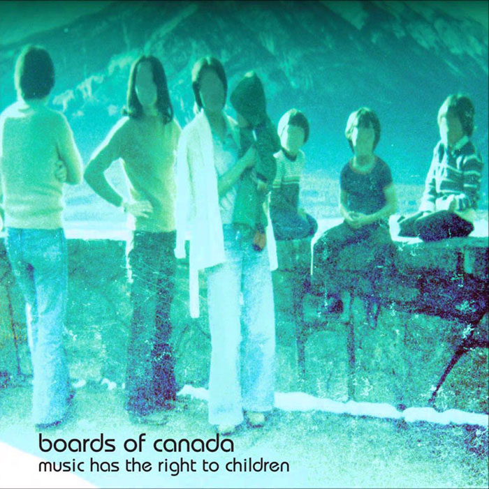
Boards of Canada – Music has the Right to Children (Warp/Skam, 1998)
Ok, I probably need at least one record that was made in my lifespan on this list, haha. This album was huge for us when it came out – I think it displayed a different way of thinking about music. Like the textures themselves were as important as the actual notes and songs. It’s like the band is playing a whole different room than most other musicians – shit, they were not even on the same PLANET! Working with the substance of music from another angle. Obviously the artwork really embraces that vibe – today that whole ghostly Polaroid thing is everywhere – but at that point it was so fresh. I still think that it’s a great cover, and the idea of listening to or looking at the texture of things, rather then the objects themselves is something I can deeply relate to.
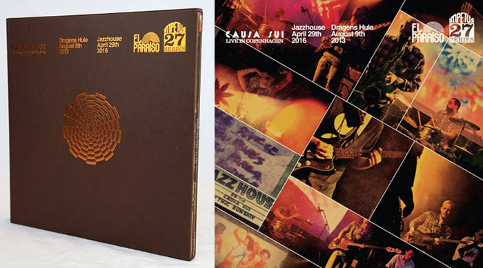
Skøtt’s band Causa Sui has a new triple live album out now, Live In Copenhagen and El Paraiso continues their run on 2017 with another upcoming release from Black Cube Marriage, a project from legendary Chicago-based cornetist, sound manipulator and improviser Rob Mazurek. Check out El Paraiso releases HERE.