Design Inspiration: Aaron Lowell Denton 
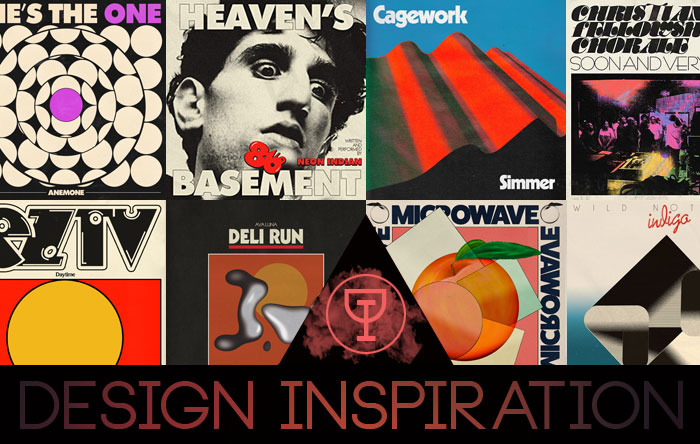
This is rapidly becoming one of my favorite features at Raven – a chance to hash out the formative touchstones that have given designers their outlook and approach. So far I’ve had designers with a longer foothold on the game, but now I’m glad to throw a spotlight on a newer name that has fast become a go-to for indie names looking for a classic touch. Aaron Lowell Denton’s been most noted for his posters and its easy to see why. His designs rely heavily on bold type and perfectly washed colors set into nostalgic forms that are hard to pin down, but tend to evoke an instant kinship with the piece. As he’s tipped more and more into album covers he’s racked up designs for EZTV, Bonny Doon, Neon Indian, and Wild Nothing among others. I asked Aaron to reach back for his top five covers and give a little background on why they’re the ones that stick out, and how they’ve helped shape his own approach to cover design.

Herbie Hancock – Head Hunters (Columbia, 1973)
I really love this record. I’m always putting it on when I need some energy. Visually, it strikes me as a great example of a sleeve representing the music inside. I love how the photo of the band members is treated…the texture of the background being blended into their figures. I also love how goofy and fun the visual is. The record has that vibe too. Super musically impressive but still a joy to listen to.

Talk Talk – Spirit of Eden (Parlophone, 1988)
I’m a big Talk Talk fan. I could have picked any number of their records as one of my favorites. Spirit of Eden is my favorite musically though. James Marsh is a big influence on me, and his pieces really tie in with Talk Talk in a heavy way. I admire the creative relationship between Marsh’s work and Talk Talk’s music. It’s cool to see a band that has sure footed sense of what art should represent their music. I bought a Japanese pressing of Colour of Spring a few years back that is one of my prized possessions.

Tatsuro Yamashita – For You (Air Records, 1982)
I’m not so sure what’s going on in this record cover, which might be the point. I’ve never even considered it before…like, why does this impeccably catchy record have an illustration of a service station on the cover? In part I think the interaction between the drawing and the colors makes you forget everything else. The record has a similar sensibility to me. It’s a lot of earnest, straight to the point love songs set to seriously infectious music. Kinda mundane normal feelings dressed up. Also might have something to do with the relationship between American pop music and Japanese artist. Either way, I love the record and the sleeve equally!

Robert Lester Folsom – Music and Dreams (Abacus Records, 1976)
There’s just no denying this cover. Hate it or love it…you must react, which I think is key in a great sleeve. I admire records like this…typically from the 60s or 70s, where the placement of things appears just random. It’s so easy now to keep everything in a grid and sensibly lined up that when I see jackets like this I just can’t look away. Is it because I love how it looks, or because it bothers me? Honestly can’t say. Musically, the record has a similar vibe…pretty straight forward but sorta off tunes. ‘My Stove’s On Fire’ and ‘Jericho’ are particular stand outs.

NRBQ, Scraps (Kama Sutra, 1972)
Something about NRBQ makes me feel extremely comfortable. Scraps specifically is a favorite. The cover image of these broken apart shoes represents the music so well. The record sounds worn in, loose, and fun. It’s like if the music animorphed into an object it would be these shoes. That text has always drawn my eye too. That relationship between the dull black and the big, bold cream text is something I’m always trying to come back to in my own work. I can source that back to Scraps for sure.


Check out more of Aaron’s Work HERE.